Thursday, March 10, 2011

Nguni Chair: Vogel Design

Cape Town based furniture designer has it spot on when re cycling old furniture styles.
Taking the old Cape furniture tradition and incorporating it cleverly into his designs the results are stunning.

Inspired by the Ngunis and their forward curving horns, the traditional cattle of the Zulu People, Vogel Living Design has created this sleek and stylish Ngunis Chair. The chair has a woven seat that resembles of the traditional riempie seats of the early European settelers in South African.


I would eat my left arm for these.....I noticed it when visiting Bistro 1862 on Steenburg Estate as all the dining furniture is done by Vogel. Bistro 1862 is a treat to the eye and palate; they do Steenburg wine tastings in the evenings served with fabulous tapas, overlooking vineyards and looking up to the mountian, really a place not to miss when in the Fairest Cape.

This has reminded me of another outstanding Cape furniture designer.....I will do an entry on him soon....bet you cant wait!!!

Tuesday, March 8, 2011

Nienke van der Meulen: Ceramic Artist

On the slopes of Table Mountain, under ancient oak trees and set amidst a small nursery, is home to Nienke van der Meulen's ceramic studio. Its sits in the creative hub which is the Montebello Centre, surrounded by Iron Mongers, Jewellers and Artists alike. Nienke creates gorgeous large sculptural vessels, inspired by the beautiful natural surroundings. Her work has a distinctly raw and African flavour, surfaces baked and textured with found objects such as porcupine quills.


While I was in Cape Town for a stint in November/ December I had the pleasure of attending her studio classes. The setting is second to none with one side open to fresh and fragrant nursery air. A tree grows right through the middle of it - it got there first...

Nienke is an extremely talented and experienced teacher, I cant think of a much more satisfying way to spend a morning than with clay oozing through your fingers as you are assisted to mould a creation from mud to vessel.

Monday, March 7, 2011

Bird Textiles Emporium

On Cleveland Street, nestled amongst Surrey Hills, sits the Bird Textile Emporium, in an old dispensary. All the wooden pharmacutical units still line the walls, drawers and glazed doors that have been opened many times over the years add a magical feel to this Emporium.

The hand printed fabrics with water based dyes have a huge focus on sustainability and style are made in the hinterlands of Byron Bay at the edge of the rain forest.

Made into table cloths, clothes, napkins the store is rammed with eye candy.


Visit their website http://www.birdtextile.com/
And read their story and the language of birds......inspiration is everywhere.
xx

Saturday, March 5, 2011

The gradual demise of Phillipa Finch

After working in a Paddington bookshop for years Emma Magenta was beginning to feel her dream of being a discovered creative was not going to happen, ever...

She started doodling her work hours away on bits of paper at the cash register, on bits of sticky tape and put them up on the wall behind her. Customers started purchasing her doodles and then one customer offered her a book deal.

Sometimes it seems its important to just put yourself out there.

She went on to illustrate Toni Collete (of Murials wedding) childrens book and now they have produced this charming little series: The gradual demise of Phillipa Finch.

I will be posting more as she starts finding herself...

Thursday, March 3, 2011

Going Retro with G Plan

I hate admitting to my TV addictions, perhaps because my last fix was Desperate Housewives....I now however have a small obsession with Mad Men.

To be a woman in those days...20 years on I keep thinking of my folks who met at the photocopier at I&J. Mike was 31, big shot and owner of a nifty little black jag, Jean - naive, 22, great 'torso' and tiny yellow mini skirt I am told. Go figure..... (Much has changed since to my relief)

Anyway - Mad Men set design is an ode to retro. I long admired the charity shoppers and now think they might have been onto something....

G-Plan is one such furniture range which epitomises 1950's furniture. Post war, during which furniture was rationed, led to pent-up demand for modern furniture.


In 1953 G Plan decided to produce a range of modern furniture for the entire house which could be bought piece by piece according to budgets. Advertising was part of the plan from the beginning and the furniture was advertised in magazines and in cinemas direct to the public. Designs were available for several years so people could collect them slowly. All furniture was marked with the distinctive brand mark.

The success of G-Plan led to one of the UK's largest furniture manufacturers, with profits increasing sixfold between 1952 and 1958 when it was floated.


Now this furniture is very collectable but can still be bought on the cheap from the unsuspecting seller....infact other furniture to keep your eye out for are brands Macintosh, Ercol or anything of Danish origin.


Early IKEA pieces are also very collectable as the brand has changed much since from quality to quantity.

Enjoy your weekend, maybe time to hit some markets to bag a bargain!
xx

PS Apologies to those this post affended....My mother still has a great 'torso', thats not what changed in case you were wondering.

Wednesday, March 2, 2011

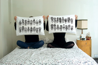
Dippy Duvet covers and Pillow cases

Some clever ideas these...

How about a bed time story written on a pillow case? Quite a good way of getting a kid to sleep on the end of the story....


Or little characters of dreams on one side, nightmare monsters the other and depending on your choice of dream for the evening you offer the selected side 'up'.


Melbourne shop 'Third Drawer Down' http://thirddrawerdown.com/ has fabulous selection of interesting items, but I do like their statement linen, designed by various artists, sound engineers and philosophers.


Quite like the idea of a white duvet cover with interchangable pillows depending on my mood....;-)

Tuesday, March 1, 2011

Finnish illustrator: Sanna Annukka

Sanna Annukka has created some wonderful designs and has the sprawn all over a variety of products.

She is half Finnish, half English, studied at the University of Brighton on the south coast of England.

In her final year, her speciality moved to the area of screen printing and the results of her practice are truly stunning. As well as being commissioned to illustrate an album cover of well known British band Keane, she now has a long list of impressive clients.

Inspired by her summer holidays near the Lapland Arctic Circle her designs are gorgeously scandanavian.

You can read more about the young and talented Anglo-Finnish illustrator Sanna Annukka on her new website which can be found here: Illustrator and print maker Sanna Annukka.


Marks and Spencer Biscuit tin
Selection of her cards


PS I have finally sorted the subscribe function....please subscribe if you would like notifications of a blog update. S-l-o-w-l-y becoming a little more blog literate, thanks for your patience! And thanks for your support, keeps me going ;-)